
The world on a flat page
How map projections change the way we see Earth
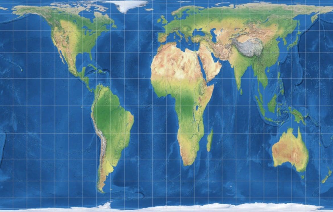
Look at a world map and it feels reassuringly familiar. Continents have recognizable shapes, oceans stretch between them and countries appear fixed in their places. Yet there is something fundamentally strange about almost every world map we have ever seen: Earth is not flat.
Turning a three-dimensional planet into a two-dimensional map is impossible without changing something. Shapes, distances, directions or areas must be distorted. This means that every world map is, in some way, an interpretation of Earth rather than a perfect copy of it.
The science of making this transformation is known as cartographic projection, and the choice of projection can dramatically change how we see the world.
A globe has an advantage
The most accurate representation of Earth is a globe because it preserves the planet’s basic three-dimensional form. A flat map, however, is much easier to print, carry, study and use for navigation or education.
The problem begins when cartographers try to flatten the curved surface of the Earth.
Imagine peeling an orange and trying to press the peel completely flat. It will tear, stretch, wrinkle or leave gaps. The Earth’s surface presents a similar mathematical problem.
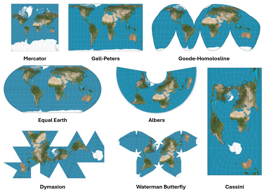
Cartographers therefore developed different projection systems, each designed to preserve particular characteristics of the planet while accepting distortions elsewhere.
The result is that two maps of the same Earth can look surprisingly different.
The Mercator map that shaped our mental picture
One of the most influential examples is the Mercator projection, developed by Flemish cartographer Gerardus Mercator in 1569.
Mercator’s projection became particularly important for navigation because lines representing constant compass bearings could be drawn as straight lines. This made it extremely useful for sailors navigating across oceans.
But the projection comes with a major trade-off.
The farther a location is from the Equator, the more its size is exaggerated. Countries and continents near the poles can therefore appear much larger than they actually are.
Greenland is perhaps the most famous example.
On many familiar world maps, Greenland appears comparable in size to Africa. In reality, Africa is roughly 14 times larger than Greenland.
The Mercator projection is not simply “wrong.” It was designed for a particular purpose, and for navigation it offered enormous advantages. The problem arises when people interpret its visual appearance as an accurate representation of the relative size of countries and continents.
Africa reveals the problem
The distortion becomes particularly striking when comparing Africa with regions in the northern hemisphere.
Africa covers approximately 30 million square kilometres. Countries such as Canada and Russia also appear enormous on conventional world maps, partly because of their high latitudes.
When these areas are viewed on a globe or an equal-area projection, the differences become clearer.
This matters because maps do more than help us navigate. They influence how we understand geography.
A map hanging on a classroom wall may quietly teach students which countries seem large, which appear central and which seem peripheral. Repeated exposure to one particular projection can make its distortions feel natural.
There is no single “correct” world map
The search for a perfect world map is ultimately impossible because no flat projection can preserve every property of a spherical Earth simultaneously.
Some projections preserve area, meaning countries maintain their correct relative sizes.
Others preserve shape, which can be useful for particular geographical purposes.
Some prioritize distance or direction.
Others attempt to create a visually balanced compromise between different forms of distortion.
This is why cartographers use different projections for different jobs.
An aviation map, a navigation chart, a climate map and a classroom world map may all represent the same planet using completely different mathematical systems.
The Gall-Peters controversy
The debate over map projections became especially prominent with the Gall-Peters projection, which emphasizes the accurate relative area of landmasses.
On this projection, countries near the Equator appear closer to their true proportions, while regions near the poles appear stretched vertically.
Supporters argued that the projection provided a better understanding of the true size of countries and challenged the dominance of the Mercator map.
Critics, however, pointed out that while Gall-Peters preserves area, it produces significant distortion in the shapes of continents.
The debate illustrates an important principle of cartography: fixing one kind of distortion usually means accepting another.
There is no magical projection that makes everything accurate.
Where is the centre of the world?
There is another question hidden inside almost every world map: Where do we put the centre?
A map centred on Europe and Africa looks different from one centred on the Pacific Ocean. A map centred on the Americas places Asia at the edges. A map centred on Asia brings the Pacific into the middle.
None of these arrangements changes Earth’s geography.
But they change the visual story.
The familiar north-up orientation is also a convention rather than an unavoidable rule. There is nothing physically wrong with producing a map with south at the top. Maps can be rotated because space itself has no universal “up.”
Historically, different societies have represented the world in different orientations and centred their maps according to their geographical, cultural or political perspectives.
The modern world map therefore reflects not only mathematics but also history and convention.
From Ptolemy to satellites
The history of cartography is filled with attempts to understand and represent the planet.
Ancient Greek scholars developed sophisticated ideas about latitude and longitude. The second-century geographer Claudius Ptolemy produced influential geographical works that helped shape European mapping for centuries.
During the Age of Exploration, improved navigation and the discovery of new coastlines forced Europeans to revise their maps repeatedly.
In 1507, German cartographer Martin Waldseemüller produced a remarkable world map that is famous for being one of the earliest maps to use the name America, in honour of Amerigo Vespucci.
Later, mapmakers such as Abraham Ortelius helped popularize the atlas as a systematic collection of maps.
Each generation of cartographers changed the way the known world was organized and understood.
Today, satellites, geographic information systems and digital mapping have transformed cartography again.
Yet the fundamental problem remains.
We still have to decide how to turn the curved Earth into something humans can view on a flat screen or page.
Google Maps changed the equation
Digital maps introduced another major shift.
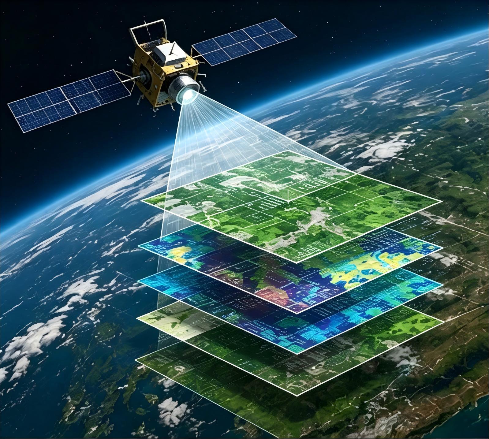
Instead of carrying a single world map, users can zoom from a global view down to a neighbourhood street. Different map layers can display roads, terrain, political boundaries, traffic, population density or environmental information.
Digital systems can also change the projection depending on the task and scale.
The familiar web mapping systems used online are often based on Web Mercator, a variation of the Mercator projection. Its mathematical properties make it particularly convenient for displaying the Earth as a continuously zoomable digital map.
The result is a world map that is no longer necessarily a fixed object.
It can change depending on what we are looking at.
Maps are arguments as much as pictures
One of the most important lessons of cartography is that maps are not neutral windows onto reality.
Every map involves choices.
What should be included?
What should be left out?
Where should the map begin and end?
Which projection should be used?
Where should north be?
What should be placed in the centre?
What should be emphasised?
These decisions can influence how viewers understand geography, economics, politics and even power.
This does not mean that maps are deliberately deceptive. Rather, it means that a map should always be understood in relation to its purpose.
A map designed for sailors has different priorities from a map designed to compare the size of countries. A map showing population density tells a different story from one showing physical terrain.
Learning to read beyond the map
Understanding map projections gives us a useful lesson that extends beyond geography.
We often assume that what we see is an objective representation of reality. But representations always involve choices.
A photograph selects a frame. A graph selects variables and scales. A news report selects facts and context. A map selects a projection and perspective.
Learning to recognize these choices does not make maps less useful. It makes us better at using them.
The next time you look at a world map, take a moment to notice what it is telling you.
Look at Greenland.
Look at Africa.
Look at the poles.
Look at which country sits in the centre.
Then ask a simple question: What would the world look like if this map were drawn differently?
The answer is not that one map is necessarily right and another is wrong.
The deeper truth is that every map changes the world slightly in order to make the world understandable.
Sources
- Library of Congress, Maps That Changed Our World
- Library of Congress, The Waldseemüller Map
- Encyclopaedia Britannica, Map Projection
- Encyclopaedia Britannica, Mercator Projection
- U.S. Geological Survey, Map Projections
- National Geographic, MapMaker and Map Projections
- International Cartographic Association
- J.P. Snyder, Flattening the Earth: Two Thousand Years of Map Projections
- Mark Monmonier, How to Lie with Maps
- Arthur H. Robinson, Elements of Cartography
Related News
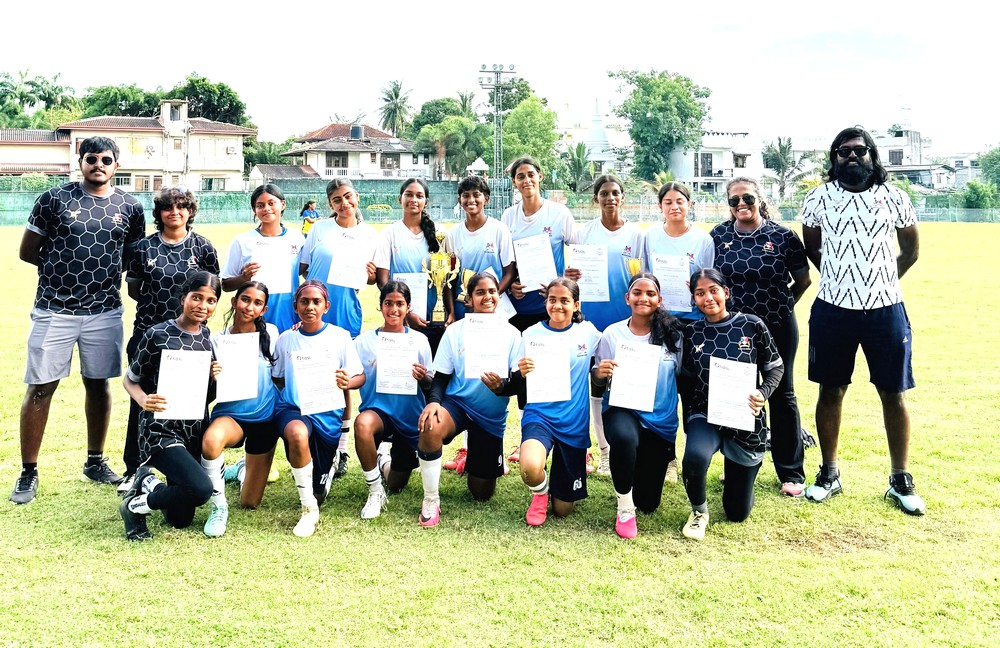
Gateway Girls Triumph in Football
Under 18 Champions: Standing Order Left to Right – Mr Rafaah Suhail (Coach), Ms Sahani Fernando (Coach), Brianna Perera, Tasneem Malik, KenuliAbeygunawardhane…
Read More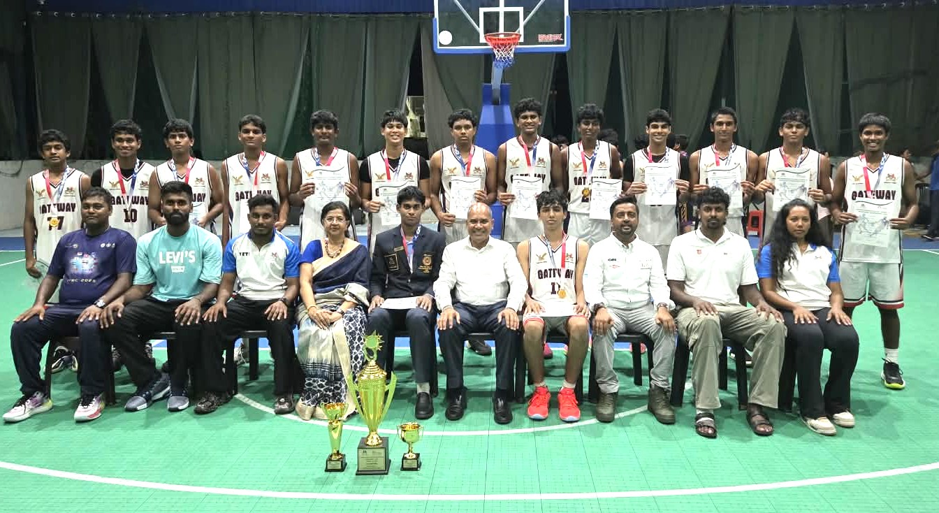
Gateway College Crowned TISSL Under-19 Basketball Champions for Fifth Consecutive Year
Back Row (left to right):DhanukaWijegoonaratne, Tevan Sela, Jonathan Herath, Mikyle Reza, Akain Vitanachy, Samuel Tsung, Thinuk Attanayaka, NavinduWaduwavala, Julan Senmitha, Jithein Kulatunga,…
Read More
USJ Leo Club’s ‘Pranadhara ’26’ Brings Water Storage Support to Habarana Community
The Leo Club of the University of Sri Jayewardenepura has completed the second phase of its ‘Pranadhara ’26’ water security project, providing…
Read More
Sri Lanka Skills Expo 2026 to promote vocational education in Colombo
The Sri Lanka Skills Expo 2026 is scheduled to take place from October 23 to 25 at Viharamahadevi Park and Green Path…
Read MoreSri Lanka ITEC Alumni Association formally launched to unite India-trained professionals
The Sri Lanka ITEC Alumni Association was officially launched during its inaugural meeting at the Grand Crystal Ballroom of Hotel Taj Samudra…
Read MoreCourses
-

The future of higher education tech: why industry needs purpose-built solutions
For years, Institutions and education agencies have been forced to rely on a patchwork of horizontal SaaS solutions – general tools that… -

MBA in Project Management & Artificial Intelligence – Oxford College of Business
In an era defined by rapid technological change, organizations increasingly demand leaders who not only understand traditional project management, but can also… -

Scholarships for 2025 Postgraduate Diploma in Education for SLEAS and SLTES Officers
The Ministry of Education, Higher Education and Vocational Education has announced the granting of full scholarships for the one-year weekend Postgraduate Diploma… -

Shape Your Future with a BSc in Business Management (HRM) at Horizon Campus
Human Resource Management is more than a career. It’s about growing people, building organizational culture, and leading with purpose. Every impactful journey… -
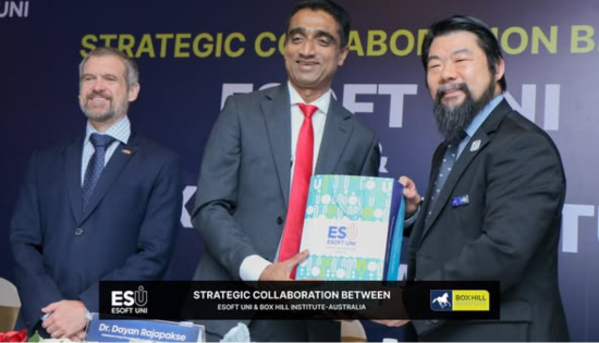
ESOFT UNI Signs MoU with Box Gill Institute, Australia
ESOFt UNI recently hosted a formal Memorandum of Understanding (MoU) signing ceremony with Box Hill Institute, Australia, signaling a significant step in… -

Ace Your University Interview in Sri Lanka: A Guide with Examples
Getting into a Sri Lankan sate or non-state university is not just about the scores. For some universities' programmes, your personality, communication… -
MCW Global Young Leaders Fellowship 2026
MCW Global (Miracle Corners of the World) runs a Young Leaders Fellowship, a year-long leadership program for young people (18–26) around the… -
Enhance Your Arabic Skills with the Intermediate Language Course at BCIS
BCIS invites learners to join its Intermediate Arabic Language Course this November and further develop both linguistic skills and cultural understanding. Designed… -
Achieve Your American Dream : NCHS Spring Intake Webinar
NCHS is paving the way for Sri Lankan students to achieve their American Dream. As Sri Lanka’s leading pathway provider to the… -
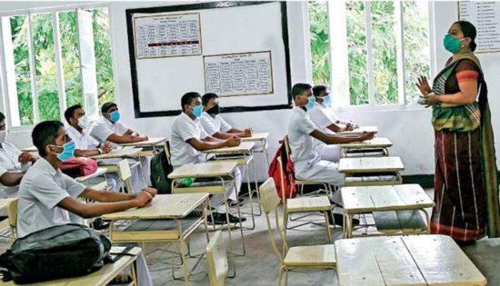
National Diploma in Teaching course : Notice
A Gazette notice has been released recently, concerning the enrollment of aspiring teachers into National Colleges of Education for the three-year pre-service… -
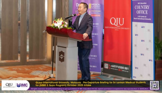
IMC Education Features Largest Student Recruitment for QIU’s October 2025 Intake
Quest International University (QIU), Malaysia recently hosted a pre-departure briefing and high tea at the Shangri-La Hotel in Colombo for its incoming… -
Global University Employability Ranking according to Times Higher Education
Attending college or university offers more than just career preparation, though selecting the right school and program can significantly enhance your job… -

Diploma in Occupational Safety & Health (DOSH) – CIPM
The Chartered Institute of Personnel Management (CIPM) is proud to announce the launch of its Diploma in Occupational Safety & Health (DOSH),… -
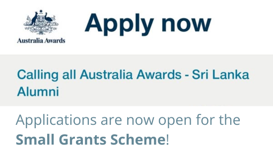
Small Grant Scheme for Australia Awards Alumni Sri Lanka
Australia Awards alumni are warmly invited to apply for a grant up to AUD 5,000 to support an innovative project that aim… -
PIM Launches Special Programme for Newly Promoted SriLankan Airlines Managers
The Postgraduate Institute of Management (PIM) has launched a dedicated Newly Promoted Manager Programme designed to strengthen the leadership and management capabilities…
Newswire
-
What did Sanga & Nasser Hussain say about Sri Lanka’s historic win
ON: October 22, 2026 -
WATCH : Highlights of Sri Lanka’a highest successful ODI run chase
ON: October 22, 2026 -
Pakistan, Sri Lanka & England ODI Tri-Series Points Table & NRR
ON: October 22, 2026 -

Sri Lanka pull off record-breaking chase to beat England by two wickets
ON: October 22, 2026 -
Sajith questions 2027 Budget without disclosure of 2026 Budget progress
ON: October 22, 2026